Skyrim talk:Ma'zaka
Image[edit]
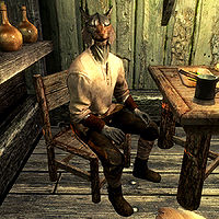
Before we start reverting back and fore again: there's two images available for this NPC as of now.
[[Image:Ma'zaka2.jpg|200px]]
(The left, old, one is not properly named to conventions, but that would be solvable). Apparently people disagree on which one is better. The left one only shows the upper torso and has part of the ears cut off, but Ma'zaka is facing the player and recognizable. The right one shows more of the character and a better context, but with the size used on the page (not on the pic itself) you just about see that there's a Khajiit. Possibly a third, better lighted one (but how without console?) would be an alternative, but as it is I am willing to accept that the right image is better as an image but for identifying the actual NPC the left one is suited better. Any comments? --Ulkomaalainen 12:29, 5 January 2012 (UTC)
- Of the two here, the second one is better. It was close enough to the proper aspect ratio that I could easily it, the other one is unfixable in its current state. While I'm sure a newer, better image will be taken in the future, this is in no way a priority. For now the one Legoless and I prefer is good enough. --AKB Talk Cont Mail 15:43, 5 January 2012 (UTC)
-
- I concur that you are the majority, but can you give any reason why you consider it "better"? For me, it is even hard to tell where Ma'zaka ends and where the wall begins, it all being small and green in green. --Ulkomaalainen 16:51, 5 January 2012 (UTC)
